Progression-Free Survival (PFS)
Progression-free survival, commonly known by the acronym PFS, is a key endpoint in multiple myeloma trials.
It measures how long a patient can live after starting treatment without the myeloma worsening. PFS is important because it can show how well a treatment can delay disease progression or maintain a response, even if it doesn’t cure the disease, and compare different therapies against each other.
In some cases, PFS is used to evaluate a treatment’s effectiveness more quickly, especially when gathering overall survival (OS) data might take longer. This makes PFS particularly useful in speeding up the approval of new treatments.
Regulatory bodies, such as the FDA, often rely on PFS data to approve new myeloma therapies when long-term survival data are not yet available.
While progression-free survival doesn’t directly measure quality of life, keeping myeloma stable for longer can help reduce symptoms, making a big difference in how one feels day to day. Today, PFS is often measured in months or even years, giving a good sense of the potential benefits of therapy.
How Is PFS Represented?
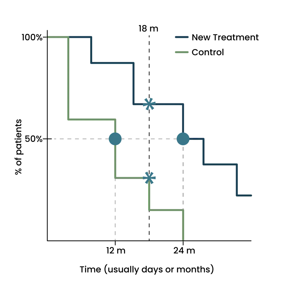
A PFS curve helps show how well a treatment works over time. We've created a mock-up to walk you through how to read this type of survival graph step by step.
What You're Looking At:
- The vertical axis (going up and down) shows the percentage of patients whose myeloma hasn't progressed, from 0% to 100%
- The horizontal axis (going left to right) shows time measured in months
- The two lines represent different groups: patients receiving the new treatment (blue line) and those receiving the control treatment (green line)
- Each line starts at 100% because, at the beginning of the study, no patients had experienced disease progression

How to Read the Lines:
- As time passes, some patients experience disease progression, causing the lines to move downward
- The less steep, the better - A line that stays flatter for longer suggests the treatment is more effective at preventing progression
- In this graph, you can see the blue line (new treatment) stays higher than the green line (control), suggesting the new treatment is more effective
Understanding Key Points To Compare Treatments:
- Median PFS: Where the 50% mark crosses each line tells you how long it took for half the patients to experience progression
- In this graph: For the new treatment, half the patients remained progression-free for 24 months, while for the control group, this happened sooner at 12 months.
- Treatment efficacy can also be compared at specific time points in time:
- In the graph, looking at the 18-month mark, more than 60% of patients on the new treatment were still progression-free, while only 30% of patients on the control treatment were progression-free.
What This Means for You:
- Higher and flatter curves mean better results.
- The gap between the lines shows how much more effective one treatment is compared to the other.
- With graphs like this, you can find out the typical outcome (median) and your chances of remaining progression-free at specific time points.