Good News for Myeloma Patients: Steadily Improving Outcomes With "Total Therapy"

The most recent issue of the journal Blood Advances provides us, myeloma patients, with good news. The article presents long-term follow-up data of over 4,300 patients from the University of Arkansas for Medical Sciences (UAMS) with newly diagnosed MM who were treated ‘in a uniform fashion [and]who have undergone long-term follow-up’. A ‘uniform fashion’ means :
‘The total therapy (TT) approach [follows] a strategy based on the use of induction therapy, ASCT, consolidation, and maintenance, and incorporated novel agents as they become available.’
The authors made it very clear that they we, myeloma patients, are not quite yet to the point where we have an ‘eradication cure’ for myeloma (i.e., where the cancer goes away for ever) but that we are looking at patients with a ‘functional cure defined as the adequate suppression of residual malignant cells to achieve sustained disease control’. The authors state :
‘This consistent approach to therapy [the total therapy approach], together with the continuous follow-up of patients over time, has provided the unique ability to evaluate improvements in long-term survival and to investigate the possibility of functional cure among patients who received ASCT.’
The authors reviewed treatment outcomes of newly diagnosed myeloma patients who started Total Therapy treatment during the period 1989-2018. ‘
To determine if survival has improved over time, patients were grouped into 5 time periods that roughly corresponded to the Total Therapy trials when novel agents were introduced, and the dates when patients on those trials were receiving their ASCT’.
Let’s take a little pause to look at the five periods in question and see what changed in terms of myeloma treatment during those periods (to the best of my ability, and I will apologize now to readers who will catch errors or omissions on my part).
Improvements in MM Treatment (by year of Auto SCT)
1997 or Earlier
- Reference period using ‘old treatments’
1998-2003
- First uses of Thalomid in clinical trials (late 90s)
- Gradually increasing ‘off-label’ use of Thalomid for MM under the Celgene STEPS program
- US FDA approval of Velcade (2003)
- Improvements in ASCT conditioning and transplant steps.
1998-2003
- First uses of Thalomid in clinical trials (late 90s)
- Gradually increasing ‘off-label’ use of Thalomid for MM under the Celgene STEPS program
- US FDA approval of Velcade (2003)
- Improvements in ASCT conditioning and transplant steps.
2004-2008
- US FDA Approval of Thalomid in RR MM (2006)
- US FDA approval of Revlimid in combination with dexamethasone (2006) – first ½ year sales of $ 295 mil (outpacing Thalomid).
- Improvements in ASCT conditioning and transplant steps
2009-2013
- Kyprolis in clinical trials
- Introduction of triplet therapy Revlimid/Thalomid – Velcade – Dex for newly diagnosed MM patients.
- US FDA approval of Pomalyst (2013)
- Improvements in ASCT conditioning and transplant steps.
2014 or later
- US FDA approval of Ninlaro (2015)
- US FDA approval of Darzalex (2016)
- US FDA approval of Revlimid for maintenance therapy post ASCT (2017)
- US FDA approval of Kyprolis (2018)
- Introduction of additional doublet, triplet and quadruplet therapies for induction, maintenance and relapse.
- Continued improvements in ASCT conditioning and transplant steps.
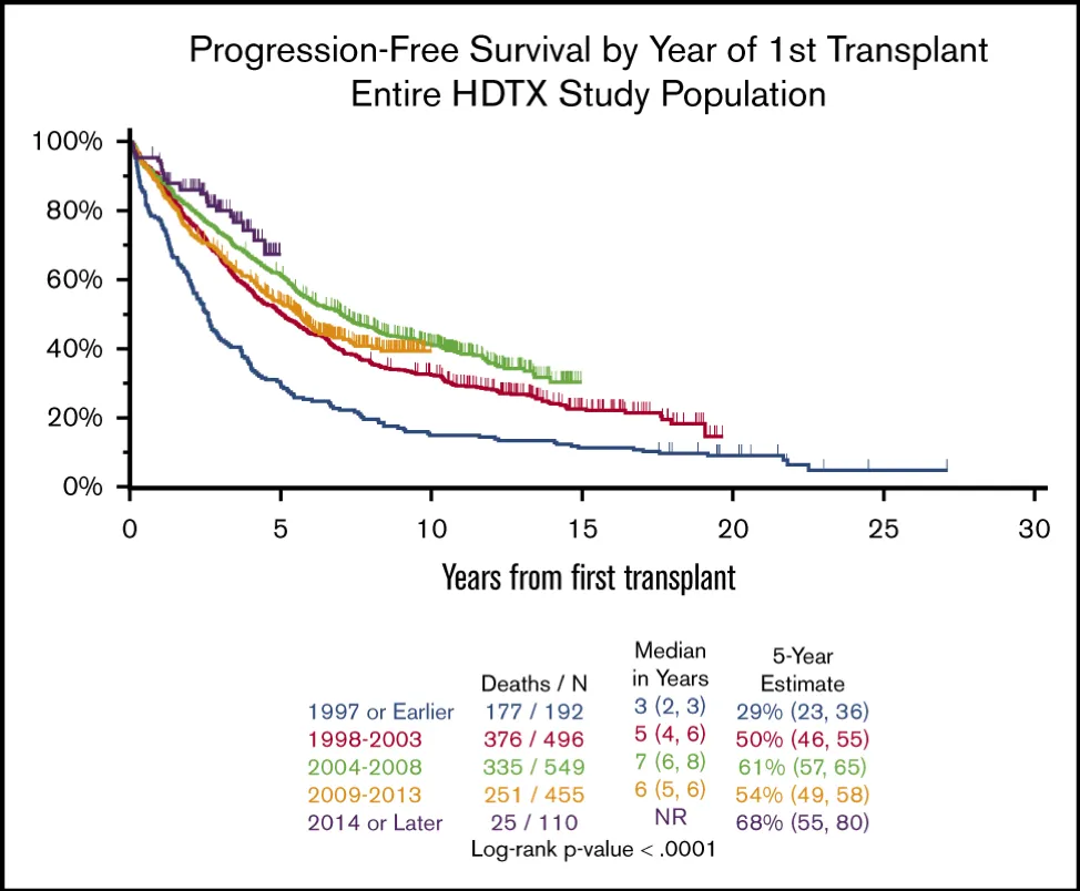
The positive impact of these advances is summarized in the chart below that I have pulled from the above referenced article (and since the article is ‘open access’ I hope that Myeloma Crowd will not run into copyright issues). Source Blood Advances.
Let’s spend a few minutes discussing/explaining this chart (called a Kaplan-Meijer chart) :
- First, this chart covers ALL patients in this survey, regardless of their cytogenetics, and therefore includes those of us labeled as ‘high risk’.
- The horizontal axis indicates the number of years patients survived from ‘first transplant’. The vertical axis shows the percent of patient with progression free survival (PFS).
- The five colored curves summarize progression free survival (PFS) for patients who started treatment in the time periods mentioned in the table above. The color coding for the different time periods can be found at the bottom of the chart.
- It stands to reason that the patient data for the earlier time periods cover longer periods of time and therefor extend further toward the right-hand side.
- I will explain the use of this chart by way of example (please refer to the arrows drawn onto the chart) :
- Pick a time period where the first auto SCT was done (I have used the time period ‘1997 or earlier’);
- Pick the number of years of PFS on the horizontal axis (I have chosen 5 years) and mark the PFS curve with a point;
- Draw a horizontal line from the intersection point just marked and read the corresponding percentage on the vertical line.
- We can now make the statement that, on average, about 30 % patients who were treated in 1997 or earlier, had a PFS of 5 years or longer.
- Just for the record, you can also do the reverse : pick a percent of PFS and then find the corresponding number of years of PFS (or longer).
- From the chart one can readily note that curves that are closer to the top of the chart indicate that better outcomes have been conferred on the ‘average patient’. For example, for patients treated in 1997 or before, only 29 %, reached the 5-year PFS point. For patients who started treatment in 2014 or later, nearly 70 % reached the 5-year PFS mark. The data block at the bottom right-hand side of the chart summarizes the percent of patients who reach the five-year PFS points for the five different treatment periods.
- There is another statistic that may be of interest: ‘median years PFS’ (see the data block at the bottom-center of the chart). The median is the point where 50% of the patients have a shorter PFS and 50% have a longer PFS. The median is not the same as the ‘average’. From this data block on the chart we can see that ‘median PFS’ for newly diagnosed MM patients has steadily improved over the past 30 years. You will note that median PFS has increased from 3 years in the period 1997 and before, to 6 years for patients who started treatment in the period 2009-2013. For the current period of this review (2014 and later), the median has not yet been reached. In other words : steady introduction of novel treatment modalities continue to steadily improve outcomes for MM patients.
There is more to report on the article referenced at the start of this post, but I will save that for later.

about the author
Paul Kleutghen
I am a patient diagnosed in 2014 with primary plasma cell leukemia (pPCL), a rare and aggressive variant of multiple myeloma and have been very fortunate to find successful treatment at the division of Cellular Therapy at the Duke University Cancer Institute. My wife, Vicki, and I have two adult children and two grandsons who are the ‘lights of our lives’. Successful treatment has allowed Vicki and I to do what we love best : traveling the world, albeit it with some extra precautions to keep infections away. My career in the pharmaceutical industry has given me insights that I am currently putting to use as an advocate to lower drug pricing, especially prices for anti-cancer drugs. I am a firm believer that staying mentally active, physically fit, compliant to our treatment regimen and taking an active interest in our disease are keys to successful treatment outcomes.
More on Treatment Advances
Trending Articles
Upcoming Events

Get the Latest Multiple Myeloma Updates, Delivered to You.
By subscribing to the HealthTree newsletter, you'll receive the latest research, treatment updates, and expert insights to help you navigate your health.
Together we care.
Together we cure.
